Color
We are optimistic. Candid deals in hard facts, but we see reason for hope. So our color palette is built on black and white, with a bright golden-orange leading the way and a wide range of hues to represent the data we work with.
Core colors
Our signature is black and white, with a golden accent. Almost everything we make uses these colors—and only these colors.

Black
C=0, M=0, Y=0, K=100
RGB 0, 0, 0 (#000000)
PMS Black U / Black C
White
C=0, M=0, Y=0, K=0
RGB 255, 255, 255 (#ffffff)

Candid gold
C=0, M=27, Y=100, K=0
RGB 254, 190, 16 (#febe10)
PMS 7549U / 7549C

Candid orange
C=0, M=42, Y=100, K=0
RGB 250, 162, 27 (#faa21b)
PMS 2012U / 2012C
Using core colors
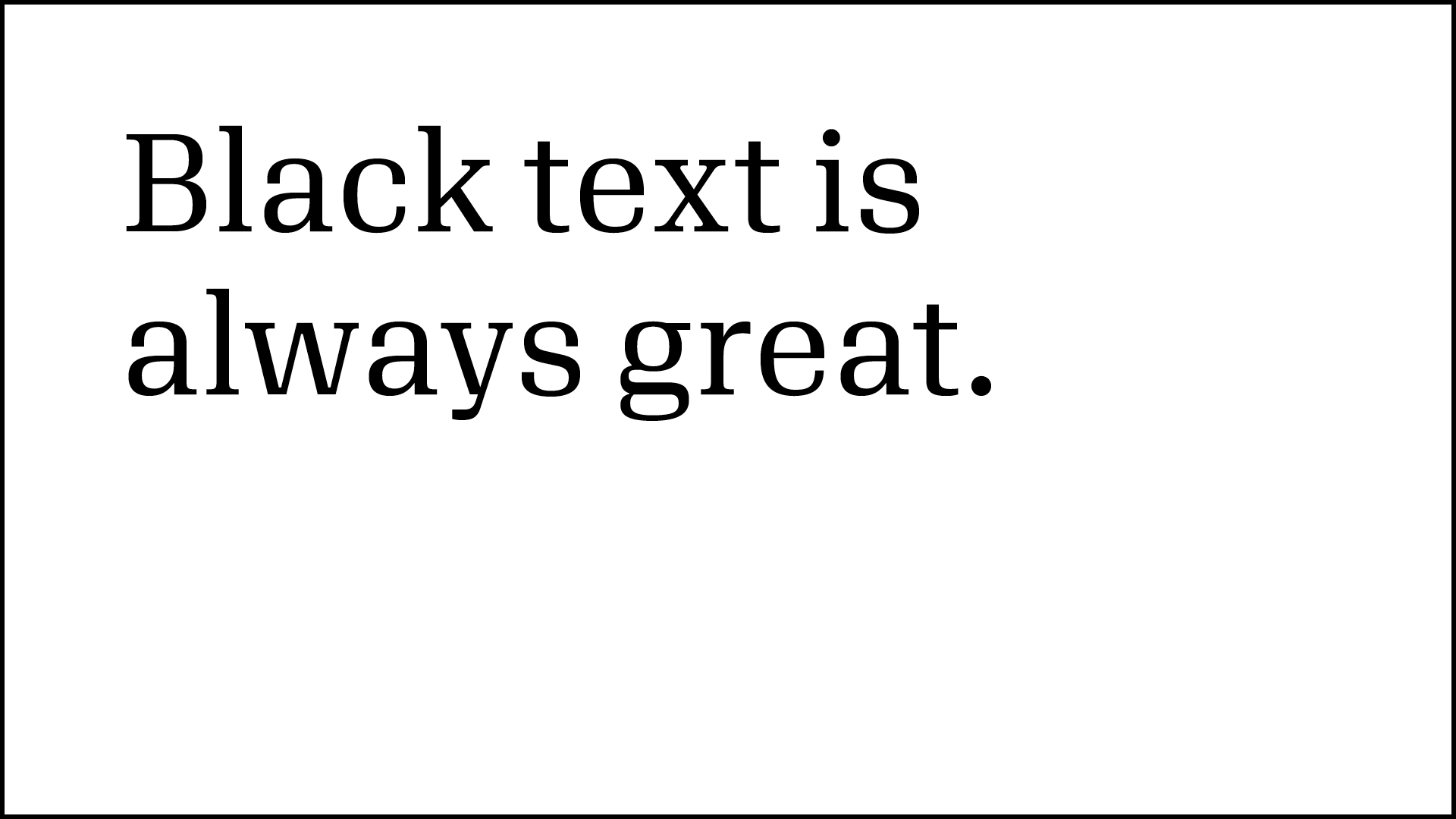
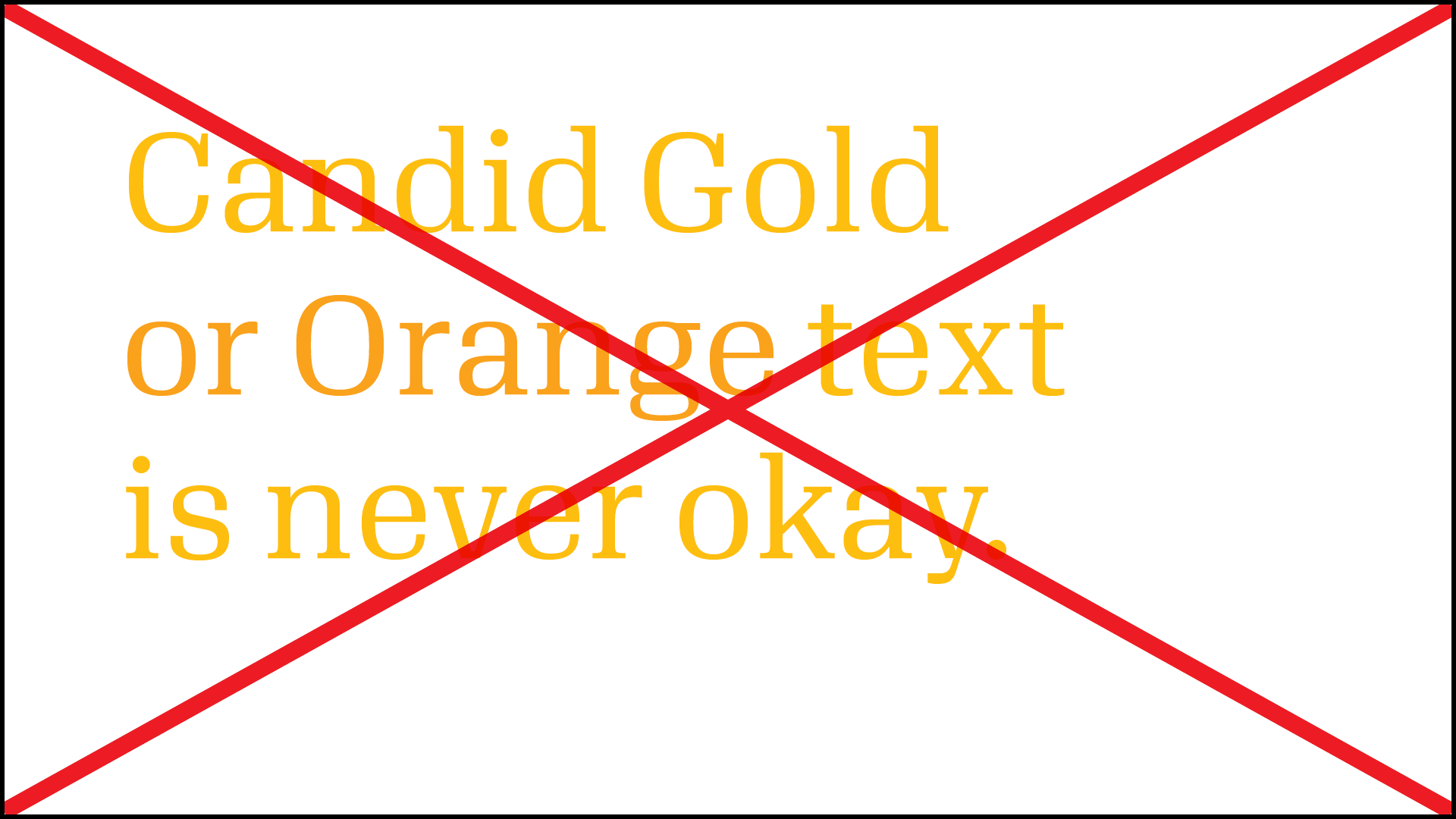
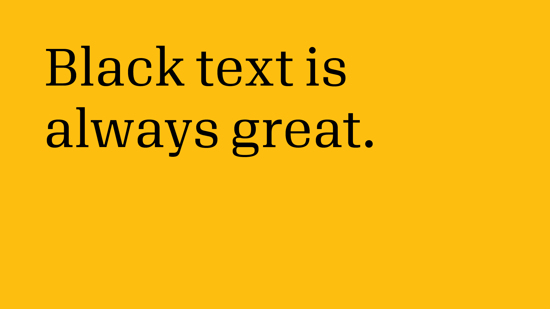
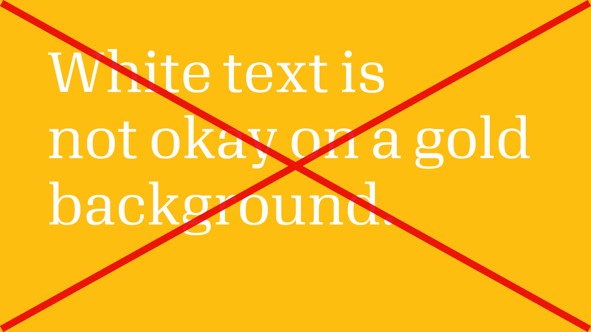
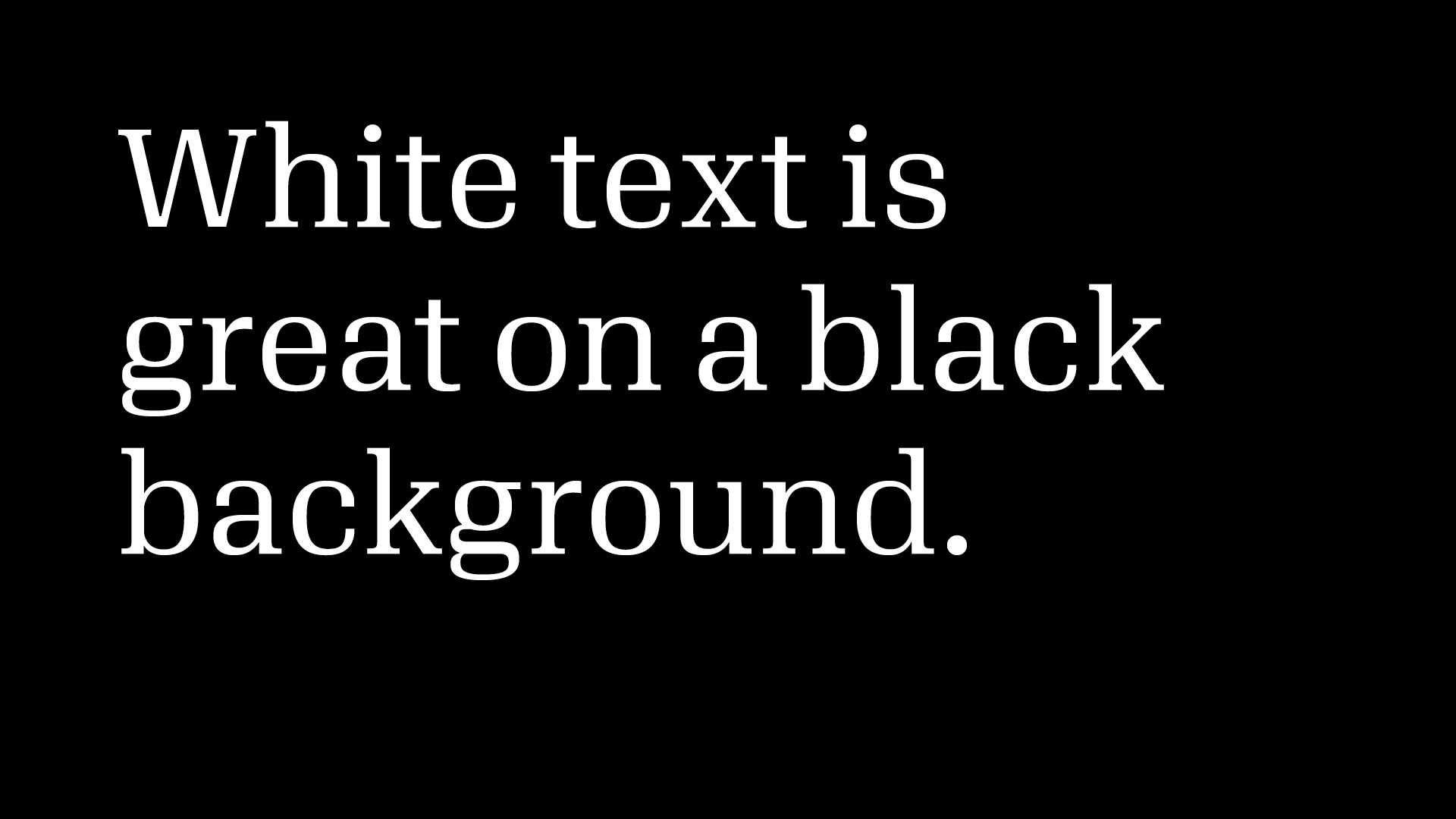
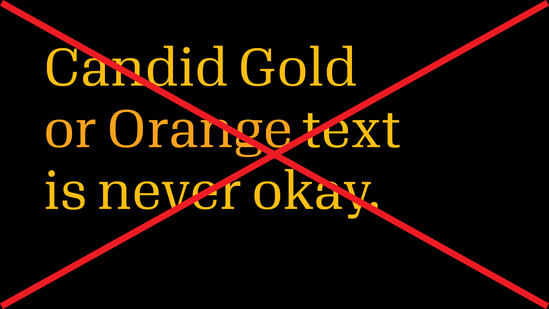
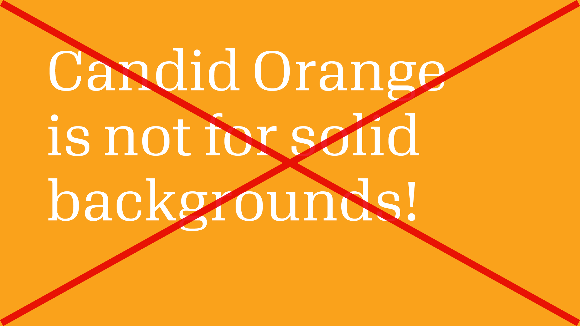
To make sure text is legible, text (and logos) should be black or white. If your background is Candid Gold, use black text for the best contrast. Candid Orange is a slightly darker shade for grid lines, annotations and patterns—anything made of thin lines. Don’t use Candid Orange for backgrounds and solid areas.
Color and accessibility
These combinations of text color and background color aren’t allowed for a reason: combinations of white with gold or orange text don’t meet accessibility standards.
Data visualization palette
Our rich data visualizations require more colors and tints. Use colors from this palette, plus our core colors, for all visualizations.
Candid gold
C=0, M=27, Y=100, K=0
RGB 254, 190, 16 (#febe10)
PMS 7549U / 7549C
Candid orange
C=0, M=42, Y=100, K=0
RGB 250, 162, 27 (#faa21b)
PMS 2012U / 2012C

Medium orange
C=0, M=70, Y=93, K=0
RGB 243, 112, 44 (#f3702c)
PMS 158U / 158C

Dark red-orange
C=0, M=90, Y=85, K=0
RGB 239, 65, 54 (#ef4136)
PMS 2028U / 2028C

Light pink
C=0, M=25, Y=0, K=0
RGB 255, 209, 247 (#ffd1f7)
PMS 671U / 671C

Pink
C=0, M=55, Y=0, K=0
RGB 247, 138, 207 (#f78acf)
PMS 223U / 223C

Medium pink
C=0, M=80, Y=0, K=0
RGB 239, 91, 161 (#ef5ba1)
PMS 232U / 232C

Dark pink
C=0, M=100, Y=11, K=0
RGB 237, 1, 128 (#ed0180)
PMS 226U / 226C

Light green
C=15, M=0, Y=42, K=X
RGB 219, 242, 145 (#dbf291)
PMS 372U / 372C

Green-blue
C=35, M=0, Y=42, K=0
RGB 161, 218, 147 (#a1da93)
PMS 7486U / 7486C

Medium green-blue
C=55, M=0, Y=50, K=0
RGB 131, 201, 148 (#83c994)
PMS 345U / 345C

Dark green-blue
C=75, M=10, Y=50, K=0
RGB 46, 170, 150 (#2eaa96)
PMS 3268U / 3268C

Light blue
C=20, M=0, Y=15, K=0
RGB 203, 232, 221 (#cbe8dd)
PMS 628U / 628C

Blue
C=44, M=22, Y=12, K=0
RGB 144, 175, 200 (#90afc8)
PMS 544U / 544C

Medium blue
RGB 82, 124, 186 (#527cba)
C=72, M=48, Y=2, K=0
PMS 660U / 660C

Dark blue
RGB 23, 71, 168 (#17479e)
C=100, M=85, Y=0, K=0
PMS 286U / 286C

Light yellow
C=0, M=0, Y=70, K=0
RGB 255, 245, 109 (#fff56d)
PMS 602U / 602C

Yellow-green
C=16, M=8, Y=100, K=0
RGB 222, 211, 33 (#ded321)
PMS 584U / 584C

Medium yellow-green
C=32, M=14, Y=100, K=0
RGB 185, 184, 51 (#b9b833)
PMS 583U / 583C

Dark yellow-green
C=50, M=27, Y=100, K=0
RGB 146, 159, 61 (#929f3d)
PMS 2305U / 2305C

Light gray
C=5, M=5, Y=5, K=0
RGB 239, 236, 234 (#efecea)
PMS Warm Gray 1U / 1C

Gray
C=20, M=20, Y=20, K=0
RGB 204, 194, 192 (#ccc2c0)
PMS Warm Gray 3U / 3C

Medium gray
C=35, M=35, Y=35, K=0
RGB 172, 159, 155 (#ac9f9b)
PMS Warm Gray 5U / 5C

Dark gray
C=50, M=50, Y=50, K=0
RGB 143, 128, 125 (#8f807d)
PMS Warm Gray 9U / 9C