Charts and graphs
We are essential. Candid knows that in this era of information overload, clarity is more valuable than ever. Our style for information graphics provides detail, but never distraction.
Style
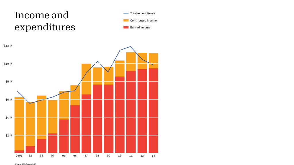
Our data visualization style is designed to be efficient and effective. It eliminates unnecessary lines and marks. Every graphic element should have a clear purpose. Question everything! It’s about communicating essential information, not following convention.
Axes
Eliminate axes markers whenever possible. Numbers distributed along an axis are enough to show where it is and how it’s calibrated.
Grid lines
Rather than add conventional lines on top of your graph, subtract them: draw them with the background color. They are just as easy to locate, but don’t add visual noise to empty areas of
the graph.
Key
Keep keys simple as possible. Eliminate unnecessary words. Use sentence case.
Source
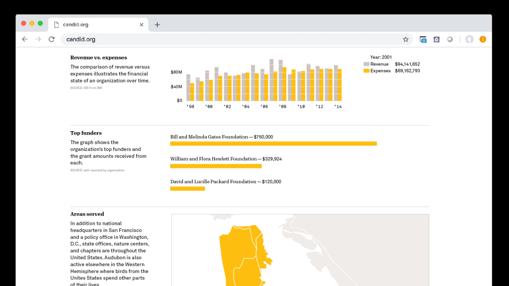
If the image will be shared on social media or elsewhere without context, make sure source information is visible.
Dos + don'ts
Don’t
Don’t make any graphic decisions that could compromise the clarity of your data. Our reputation is built on clear, precise, and accurate information.
Don’t
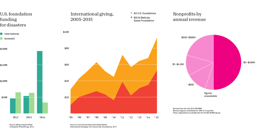
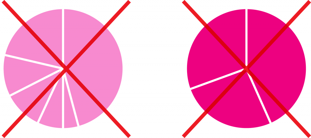
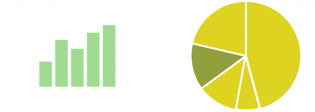
Never use a pie chart with more than five slices. And don’t use a pie chart if there isn’t a noticeable difference in size.
Do
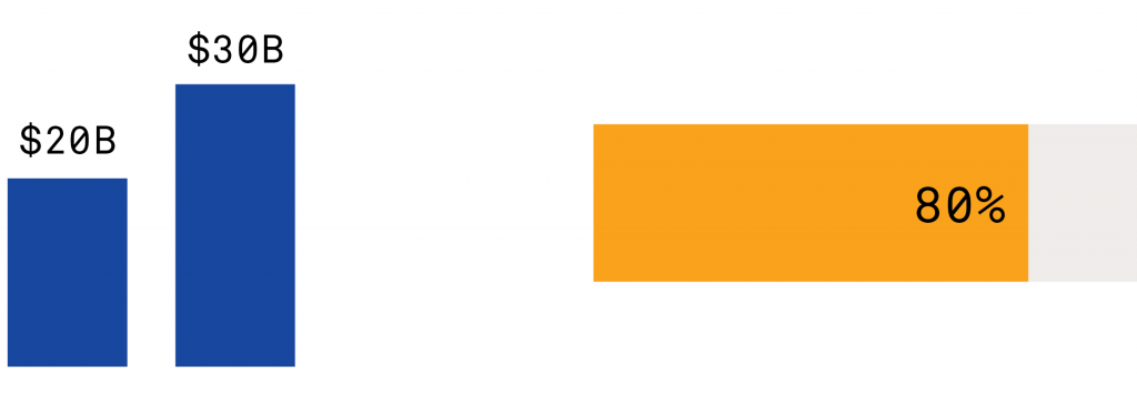
Put the data first. If it’s meaningful data,
it won’t need any graphic flourishes to have an impact.
Do
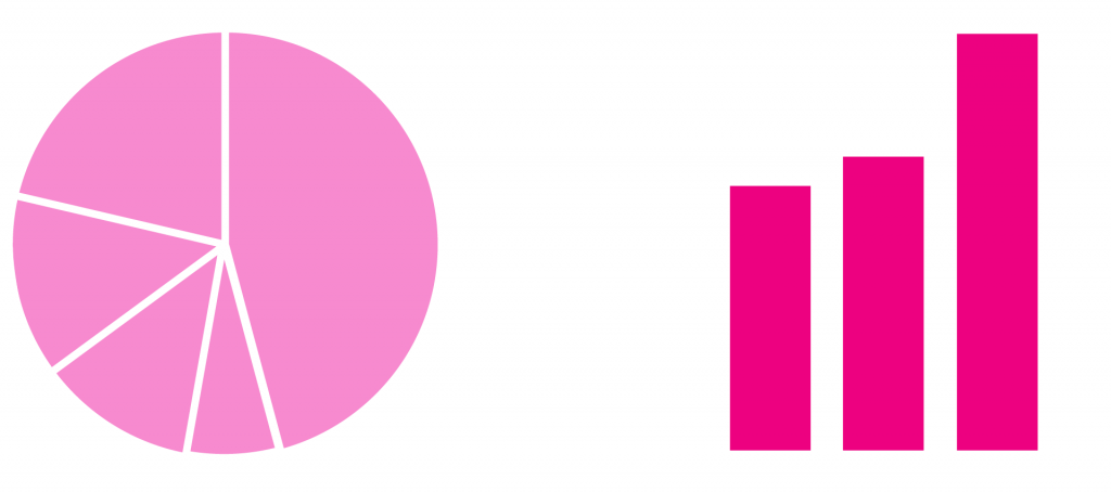
Collapse smaller segments into a group, and use a bar chart if differences are subtle. It’s easier to tell the difference between bars than pie slices.
Don’t
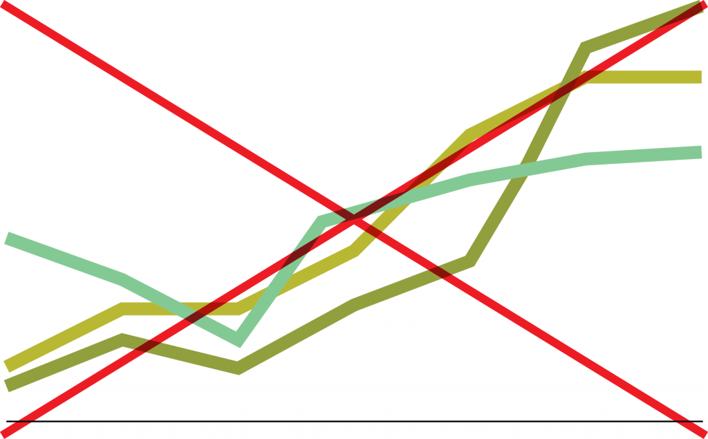
Don’t use complicated patterns and colors in the same graph. It’s distracting and hard to follow.
Do
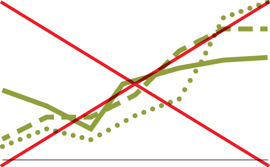
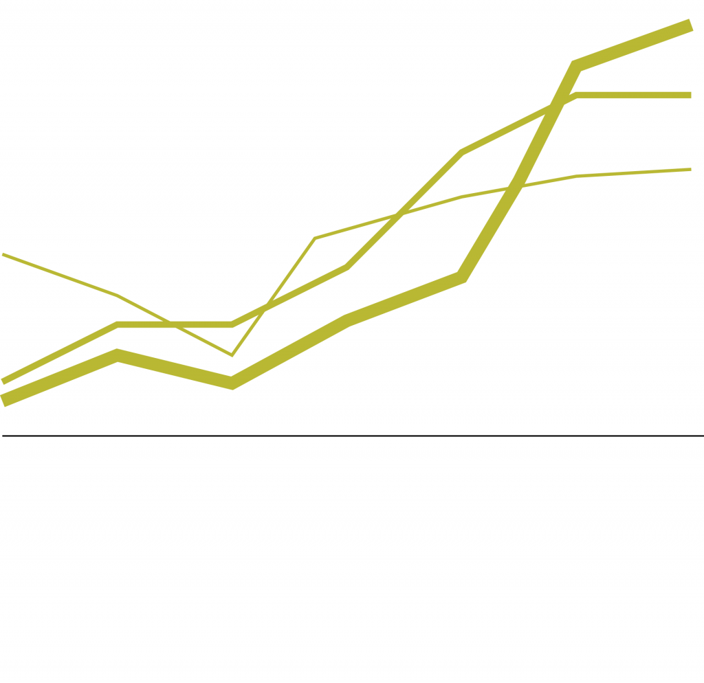
Use weight to distinguish lines in a line graph.
Do
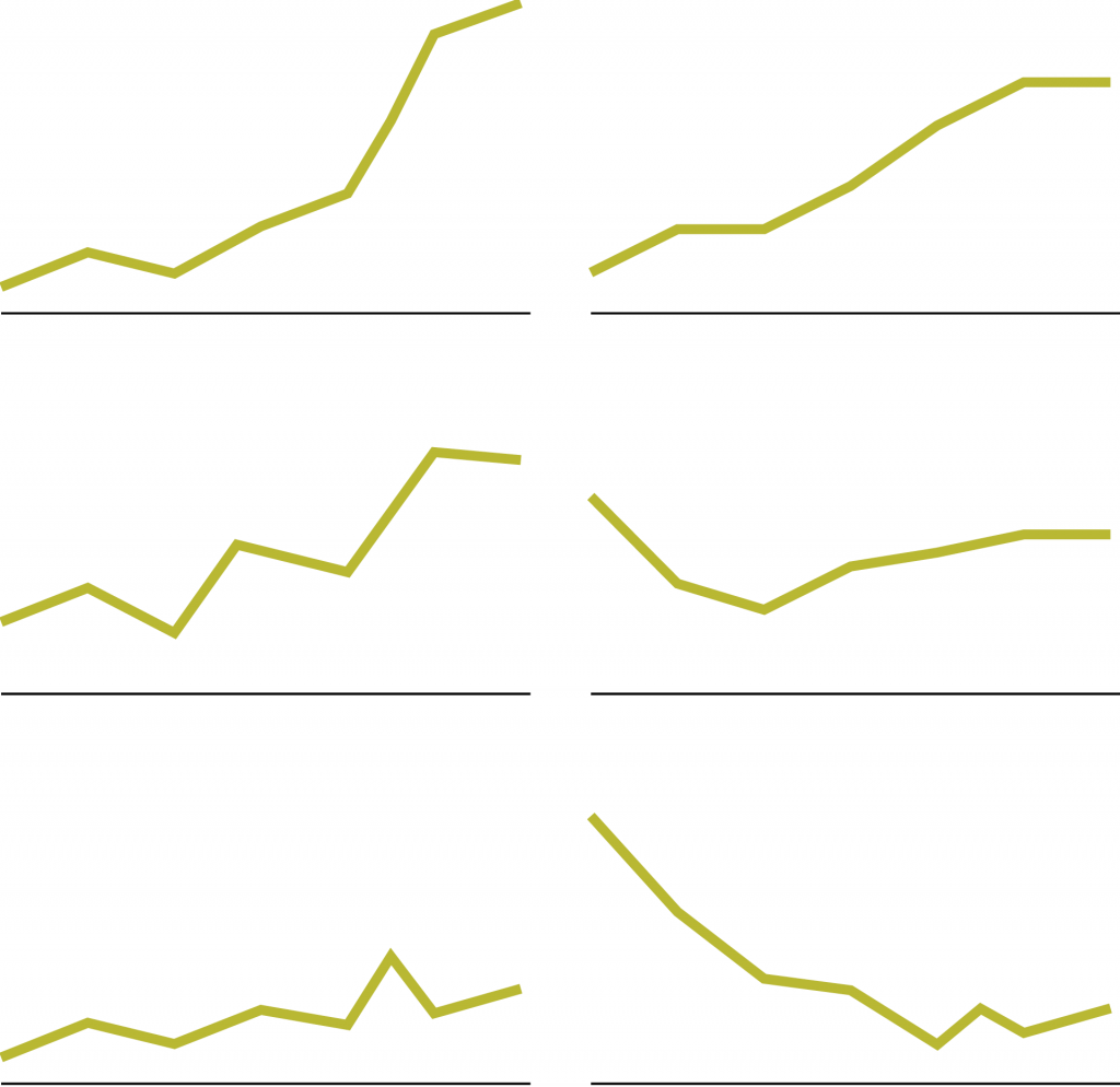
Use side-by-side line graphs when you have more than four measurements. Five or more lines in one chart makes for a tangled mess.
Don’t
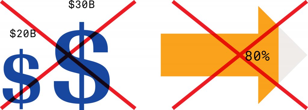
Never add illustrations in an attempt to add interest. In reality, they add distraction.

Don’t
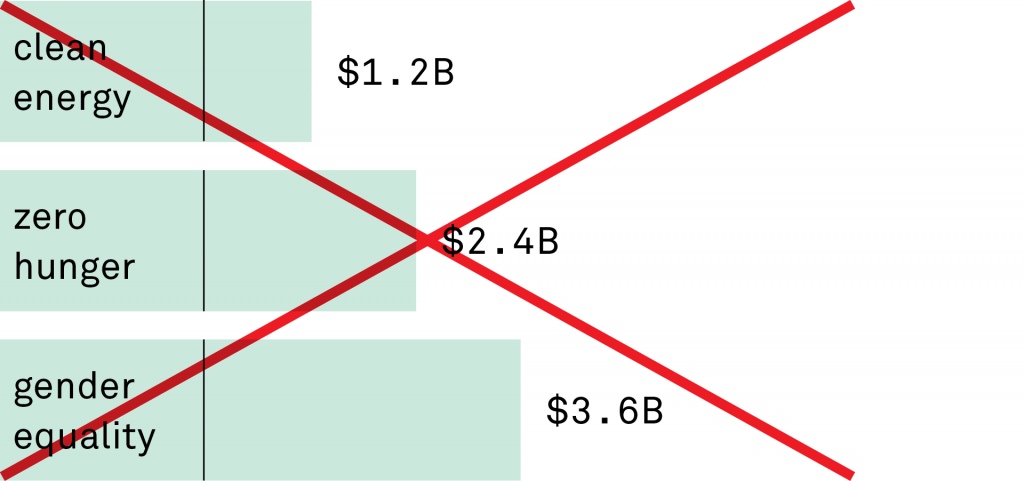
Don’t use shapes in place of bars. It’s harder to discern where they start and end, which can lead to misinterpretation.

Do
Trust that your data is valuable. Let it speak for itself.
Don’t
Don’t use odd shapes in place of standard bars or circles. They are difficult to assess.
Do
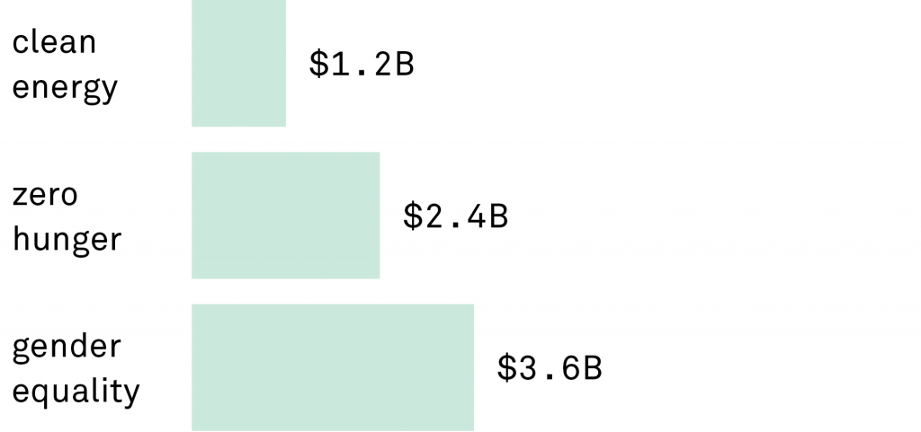
Use bar height or width to compare measurements.
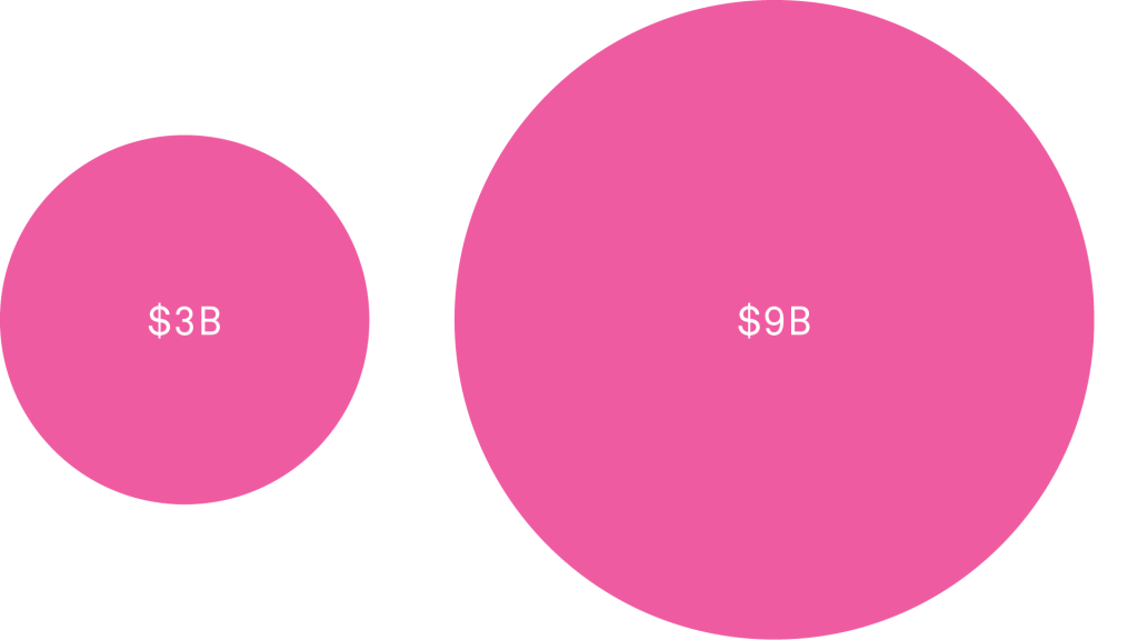
Don’t
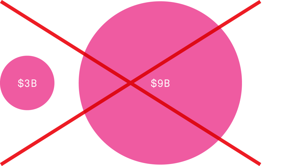
Never confuse scale with height. If you enlarge a circle, you enlarge its height and its width—and therefore its area. Most people would say that the larger circle below is more than 3 times the size of the smaller, which makes it misleading.
Do
Think about the assumptions your viewer will make. Scaled circles are harder to compare, but if you must, compare their areas.