Typography
We are trustworthy. Candid has a reputation for robust information and informed expertise. The typography we use reflects that, employing crisp, readable typefaces in accessible, organized layouts.
Signature type family
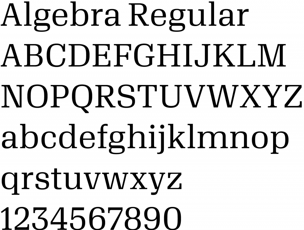
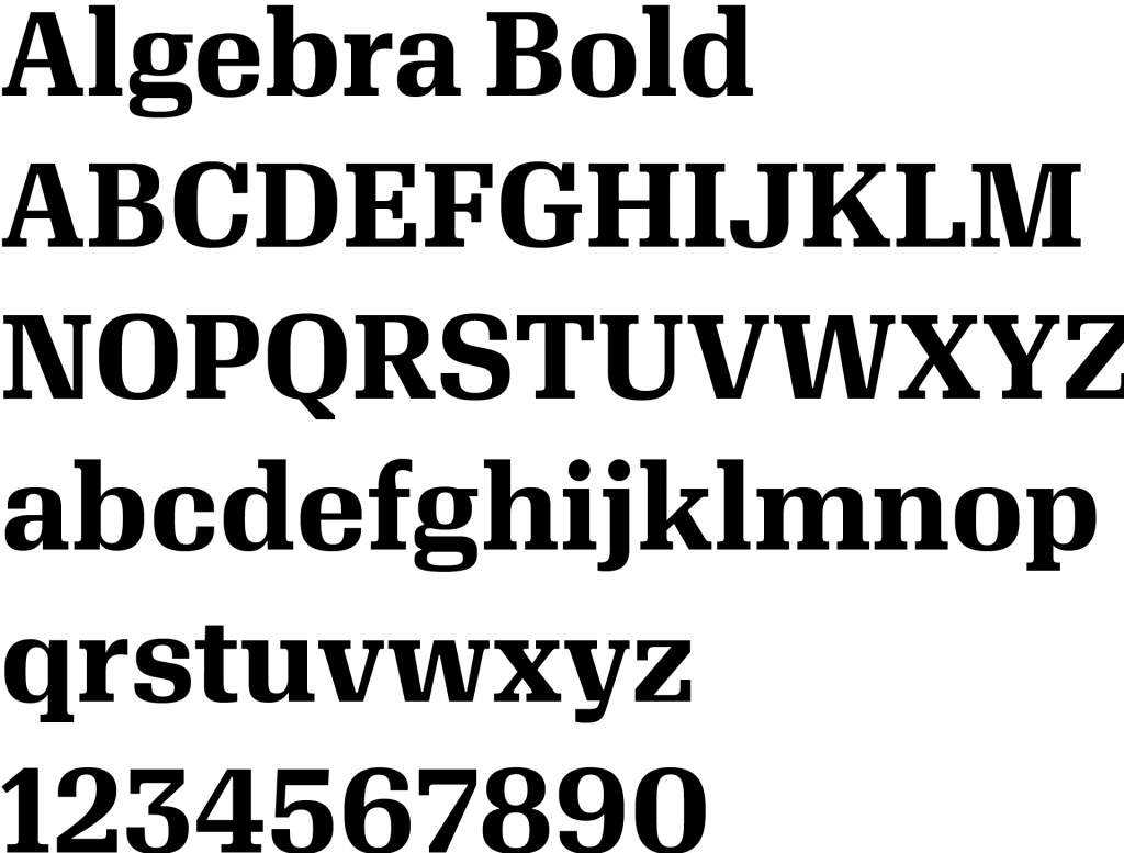
Our signature type family is Algebra. Its squarish shapes give an impression of solidity and history, while its crisp terminals keep it fresh and contemporary. These typefaces require a special license and installation to use, so they’ll be used only by design staff. (For everyday fonts, see Tertiary typefaces.)
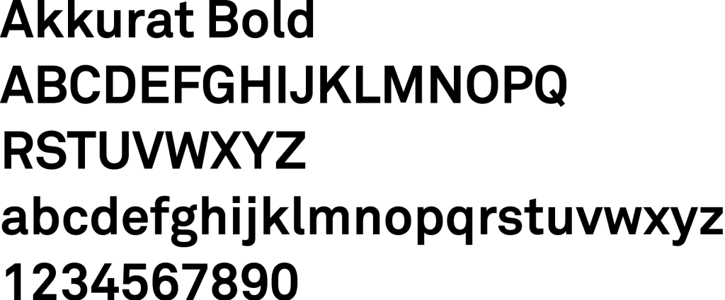
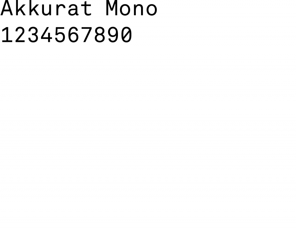
Secondary type family
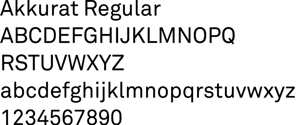
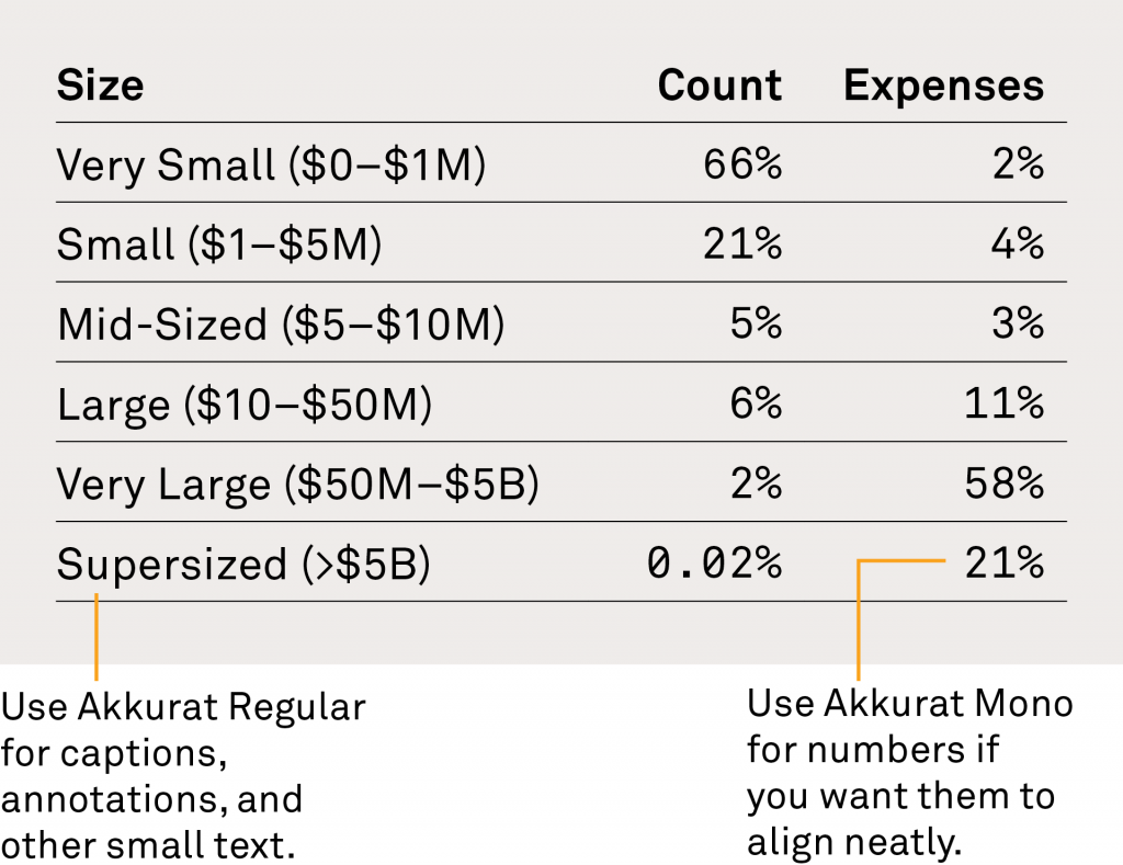
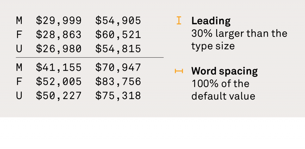
You’ll see our secondary type family used for small text such as captions and annotations. Akkurat is legible when small. Akkurat Mono is useful when numbers need to align precisely, as in tables and graphs. Like Algebra, Akkurat requires a special license, so it will be used only by design staff. (For everyday fonts, see Tertiary typefaces.)
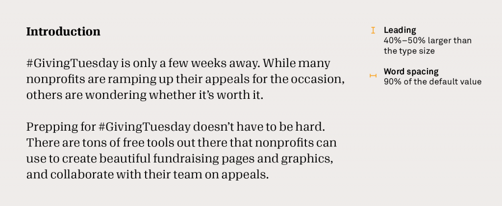
Typsetting for print
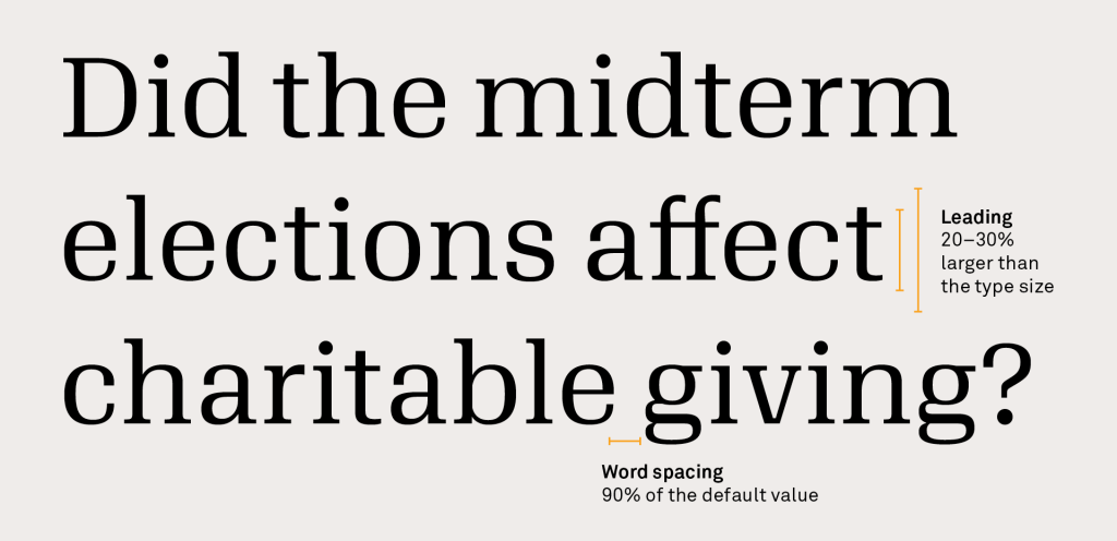
Use these settings for large text, body copy, and captions in print. These are important for legibility and consistency.
Adjusting leading
Use these leading settings as a starting point, and adjust up or down depending on context. Narrower text blocks will need tighter leading than wide ones, at both text and display sizes.
Headlines
Body text
Captions
Other small type
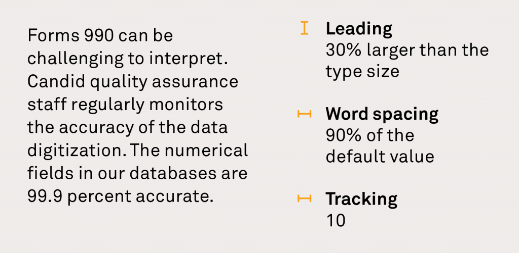
Typesetting for screen
Use these settings for large text, body copy, and captions online. Some sites may need adjustments, but this is a good place to start. Algebra degrades below size 16px, so it’s especially important not to use it any smaller than that.
Line-height
h1–h5 styles have line heights of 1.333em.
h1 text is 60px
h2 text is 48px
h3 text is 36px
h4 text is 24px
Line-height
Smaller text should have more leading.
h6, p, navigation items, and small labels/captions
should have 1.5em.
h5 text is 16px bold
p is 16px regular. The line height of both h5 and p text is 1.5em (24px).
This style is for nav items, labels, and captions: size 14px.
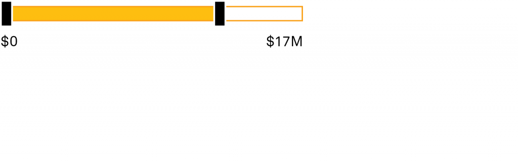
Forms
Sliders
Web text color
Web text black
RGB 30, 30, 30 (#1e1e1e)

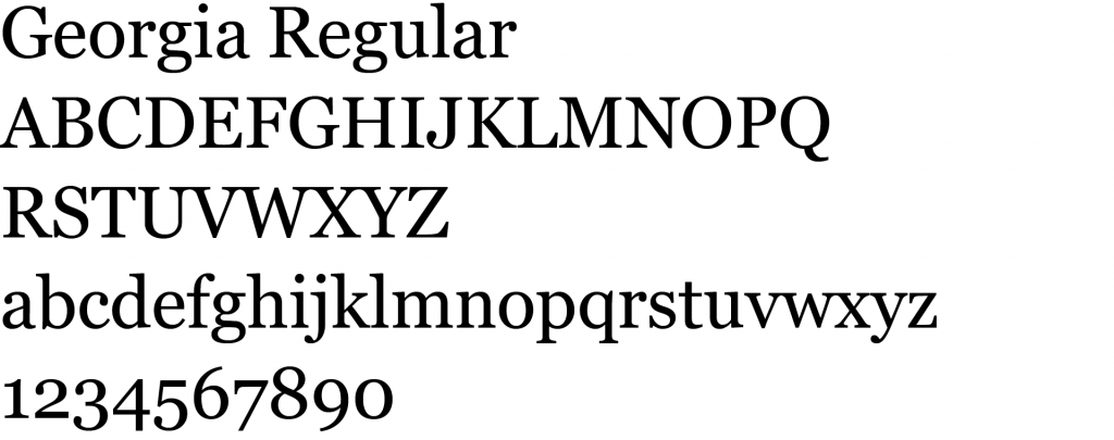
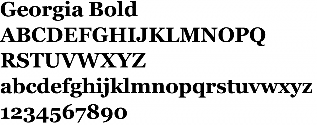
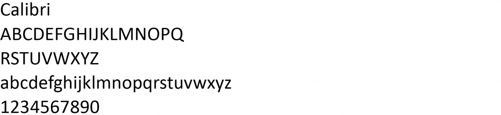
Tertiary typefaces
Use Georgia for all Word documents, slide presentations, and emails. Georgia is installed on nearly every computer, so you can be sure that your documents will display correctly when you send them to colleagues and customers outside of Candid. You can use Calibri for small text such as captions, chart and graph labels, and tables.
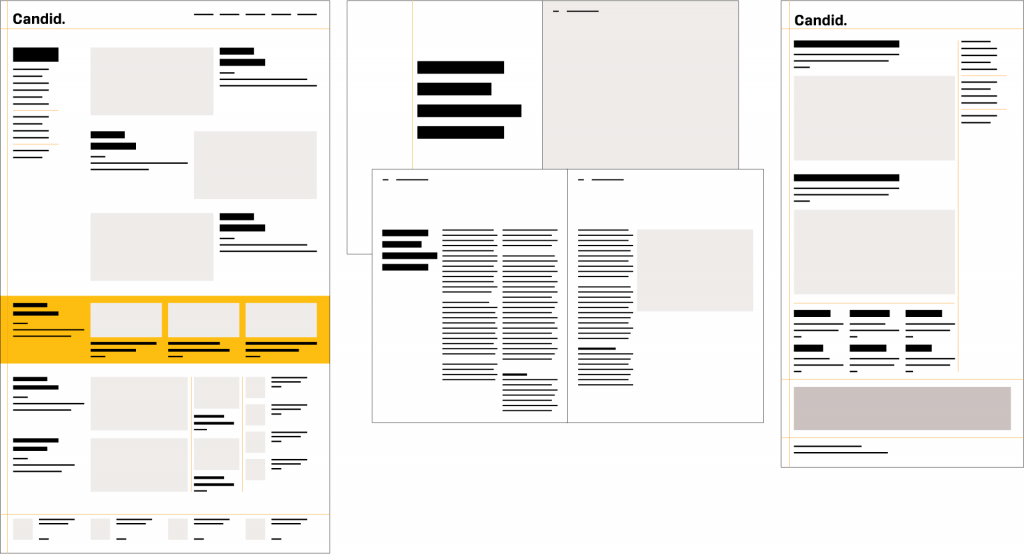
Grids
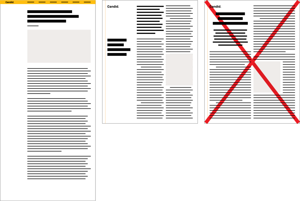
Pages are structured with a clear typographic grid: rigorously organized, rational, and matter-of-fact.
Dos + Don'ts
Justified text looks too formal and rigid. And centered text looks too ornamental—and it obscures the clarity of the grid. Also, when possible, reserve some of the grid for negative space. Its contrast with the text areas calls extra attention to the clear, rational organization.