Logo
We are direct. Our logo is the simplest distillation of our voice. It links every website, report, email, and tweet.
About our logo
Our name speaks for itself. We don’t need a picture or symbol to communicate what we stand for. Our logo is a straightforward treatment of our name, with a definitive period at the end. The letters were custom-drawn to feel both contemporary and timeless, and to complement our other visual elements.
Our name is simply Candid; the period is not part of our name. Our logo makes a one-word sentence out of our name, but in all other situations, you should punctuate normally. See Writing for more.
Black logo
White logo
Logo sizes
Our logo comes in two sizes: one for ordinary use, and one that is more legible at very small sizes.
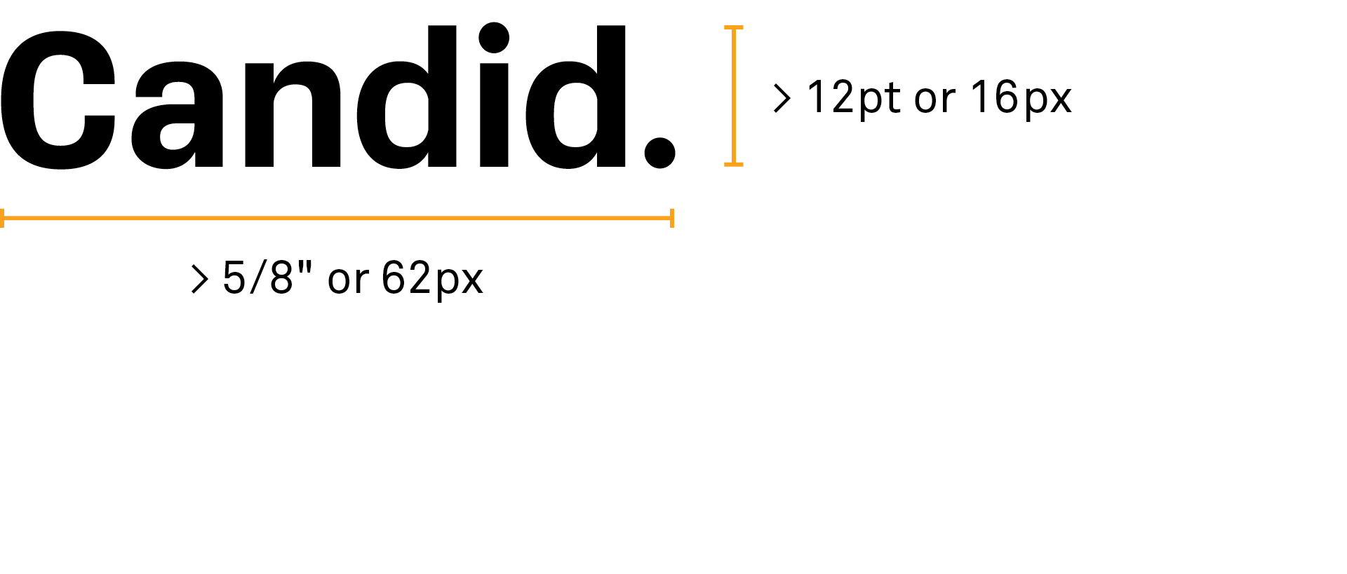
Standard logo
Use this one when you can make the logo large. There’s no upper limit on size.
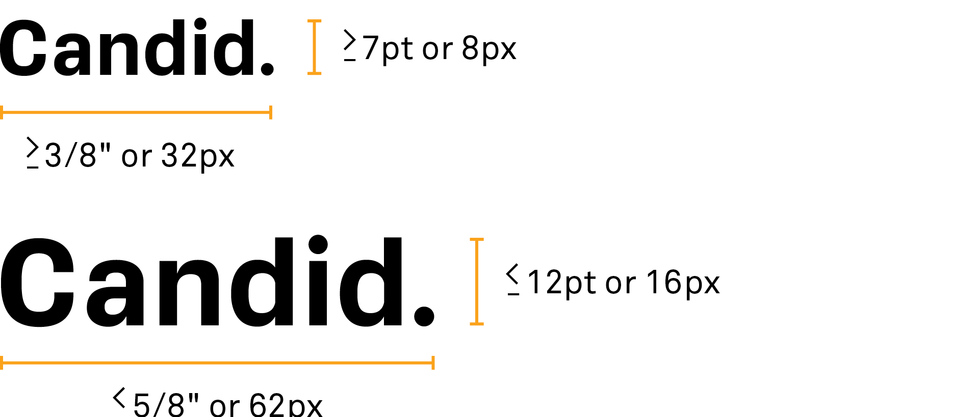
Small Logo
Use this one when you must show it small. But everything has limits! If you have less than 3/8 inches (or 32 px) available, use the icon instead.
Pairing the logo with text
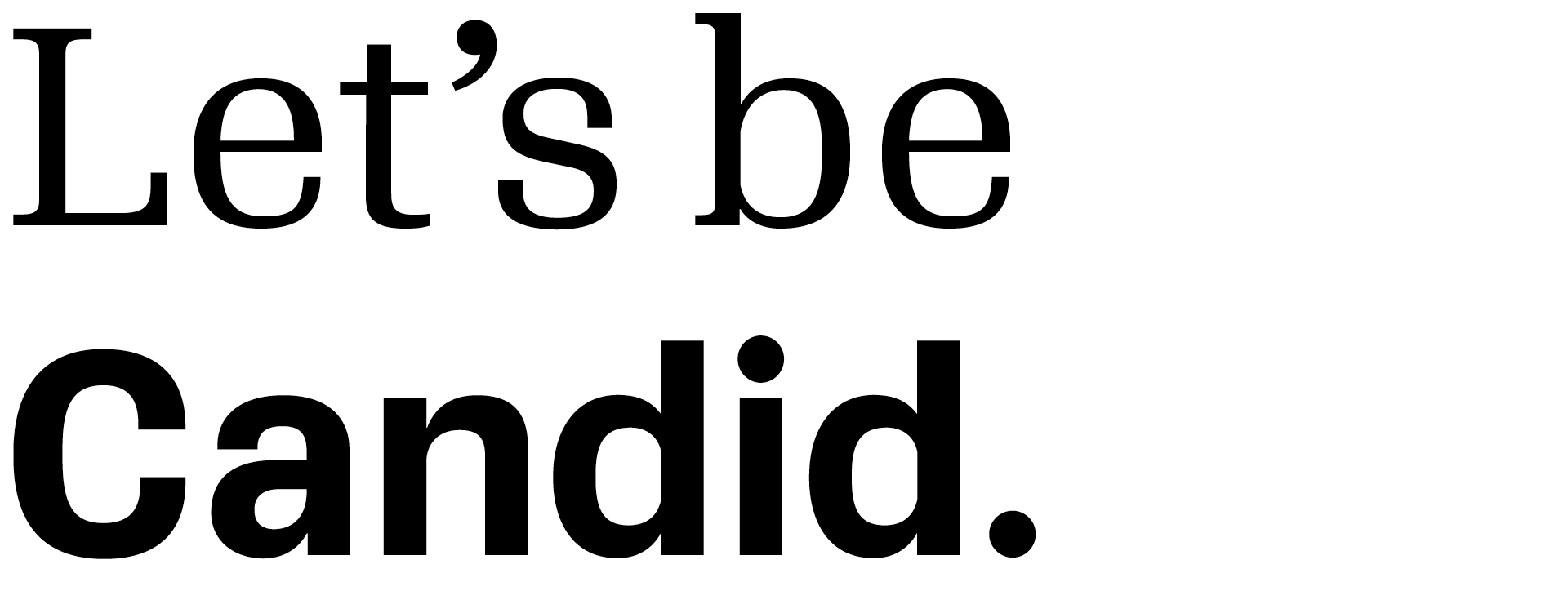
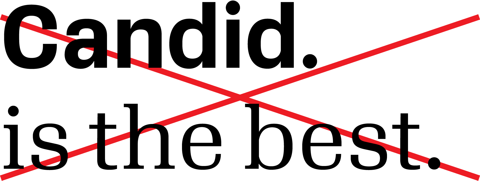
Since our logo is so simple, it can be used naturally in a line of text. Because of the period in the logo, it must be used where a period is natural—at the end of a sentence or as a url. It’s tricky to get the sizing right, so leave it to the design teams. Don’t put the logo in a sentence in an ordinary email, letter, or presentation.
In a sentence
Our logo, since it contains a period, must be used at the end of a sentence.
As a URL
Our logo also can become part of our URL.


Sizing
Sizing can be difficult. The logo should look neither larger nor smaller than the surrounding text.


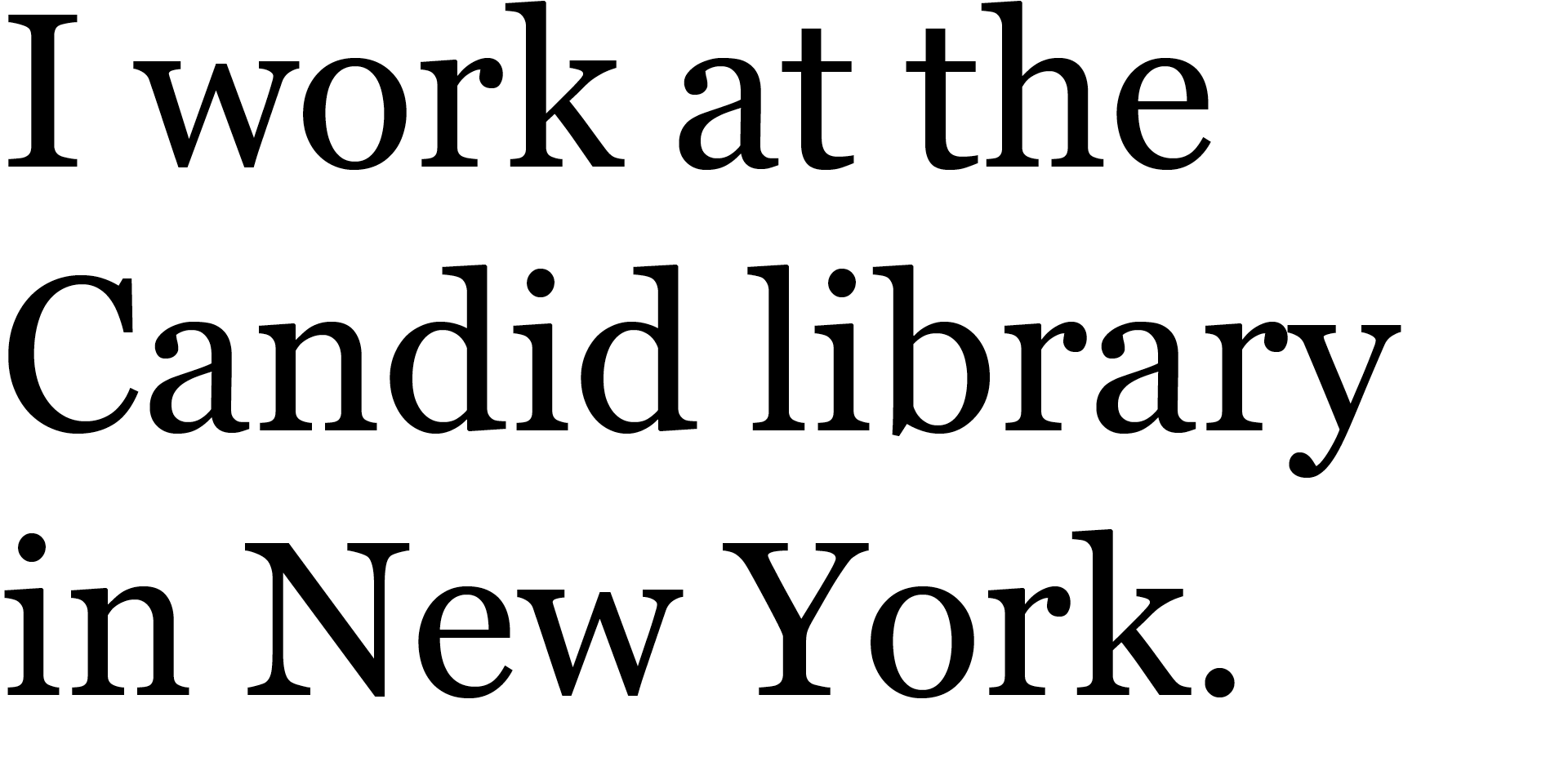
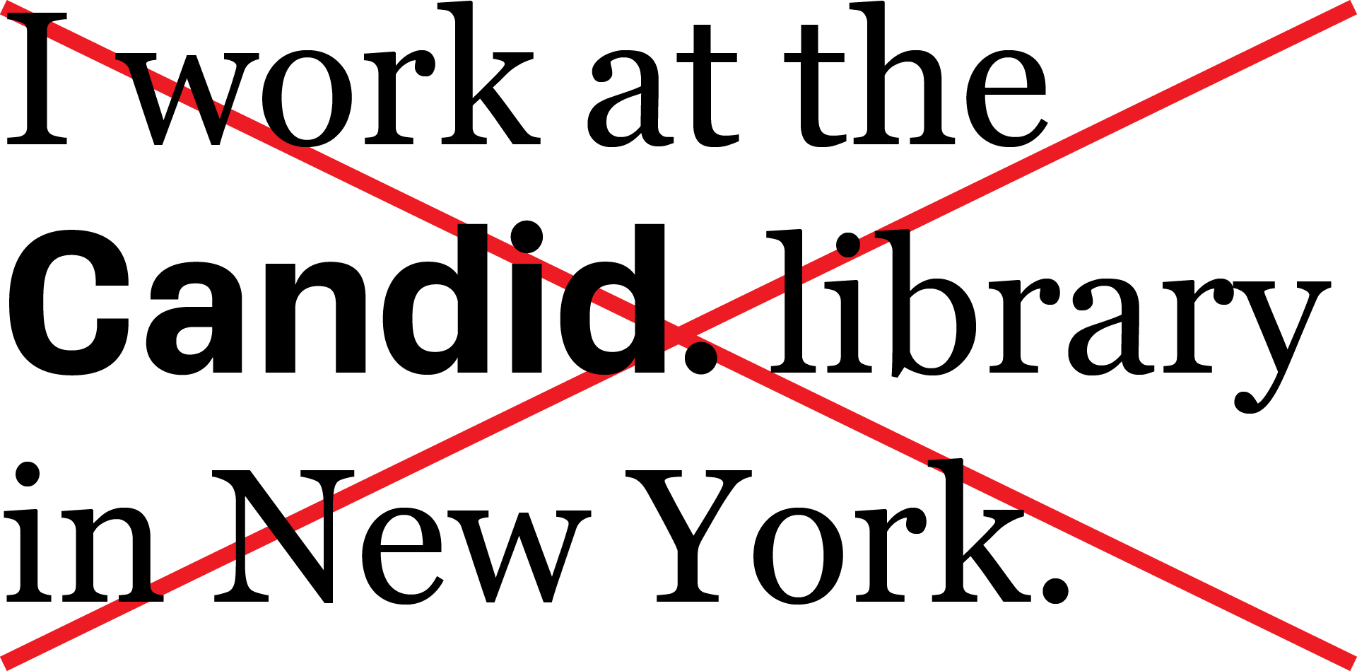
In plain text
Leave the logo to the desginers. Don’t insert it in ordinary text. Just use the name Candid in the same font as your surrounding text.
Dos + don'ts
Our logo must be used consistently to build recognition. Take these precautions to make sure the logo is always legible and seen the same way.
Do
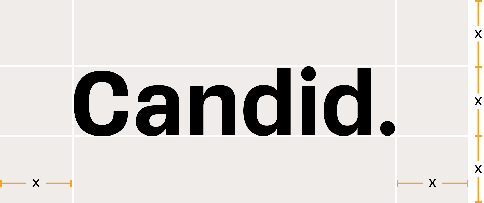
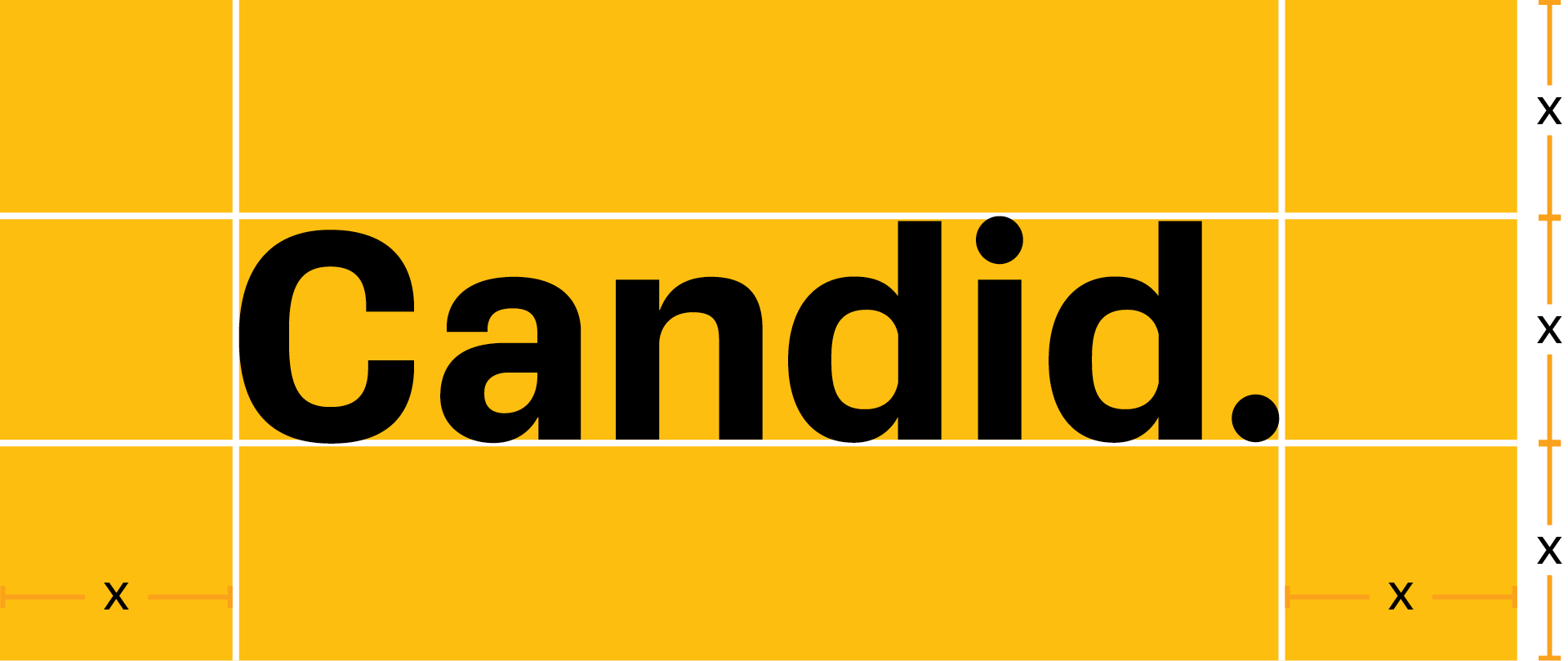
Give it a little room: use the height of the “d” to establish a clear space around the logo. Don’t let text or images cross into this space.
Don’t
Don’t use the logo on backgrounds that compromise legibility. Don’t change the color, make it translucent, or modify it in any way. Don’t make your own version of the logo or add special effects.
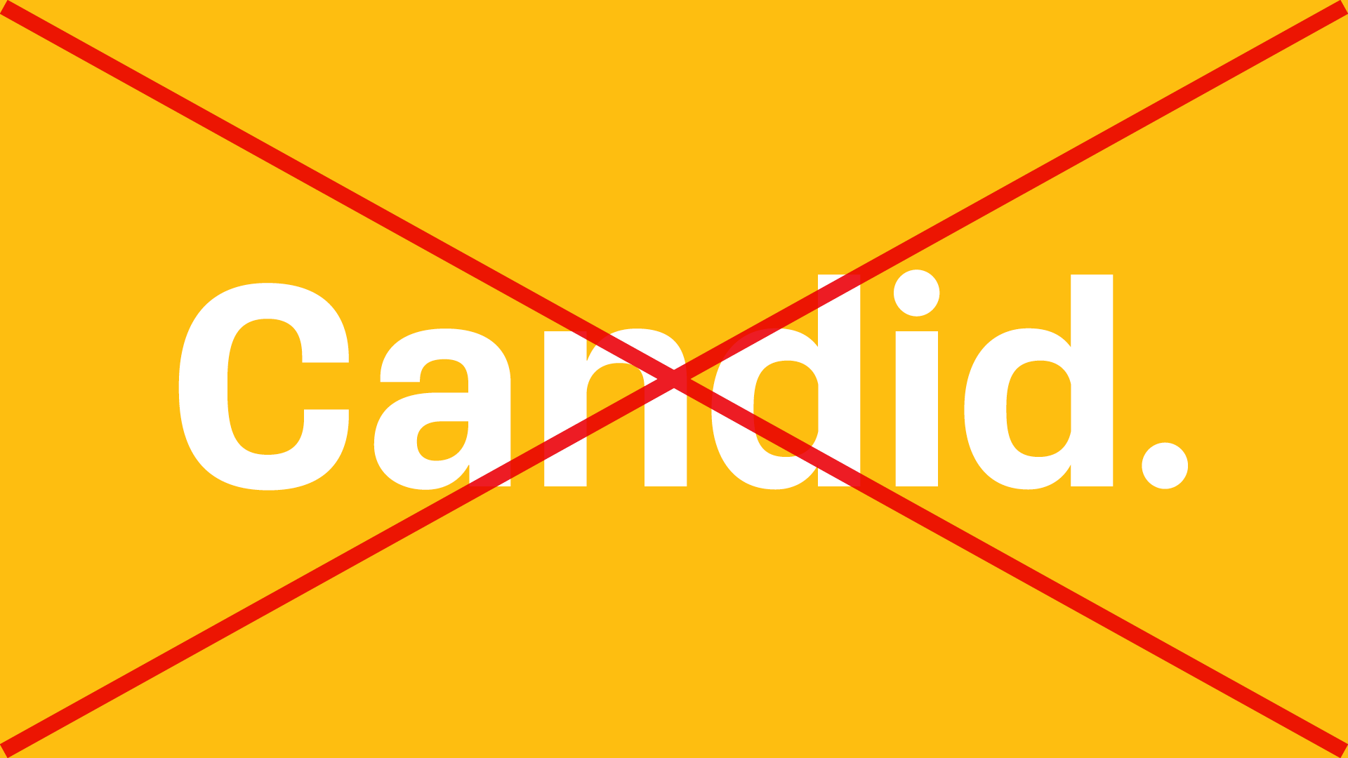
The white logo is only for black backgrounds.

Don’t place the logo on top
of an image.
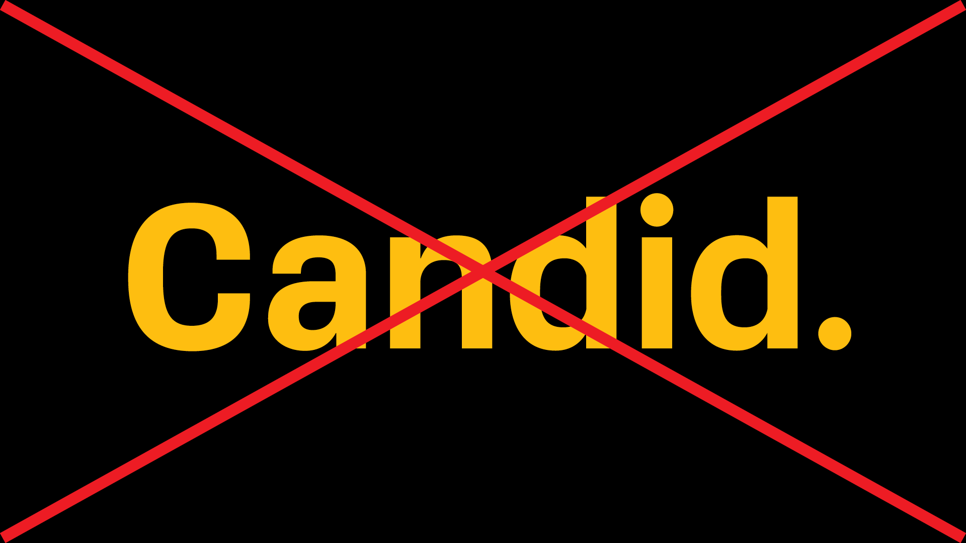
Don’t change the logo color.
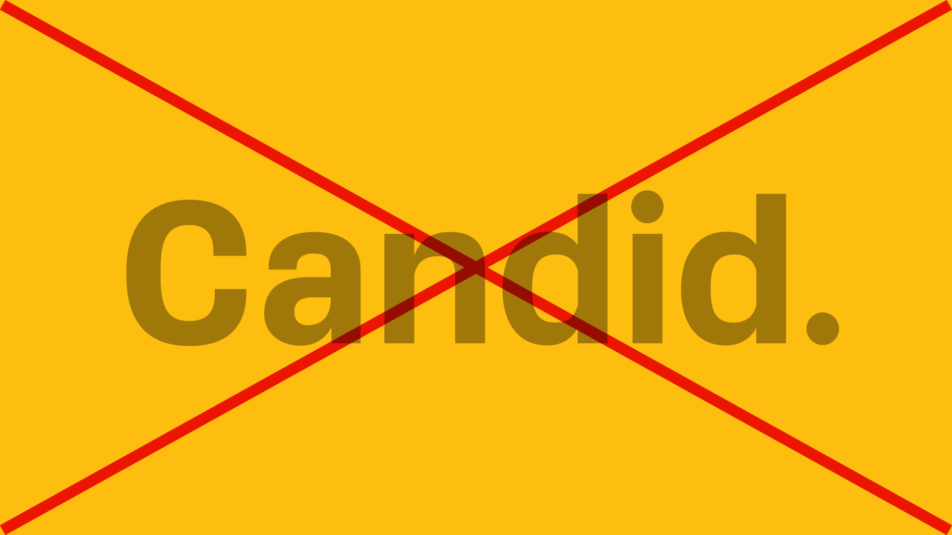
Don’t make it translucent.
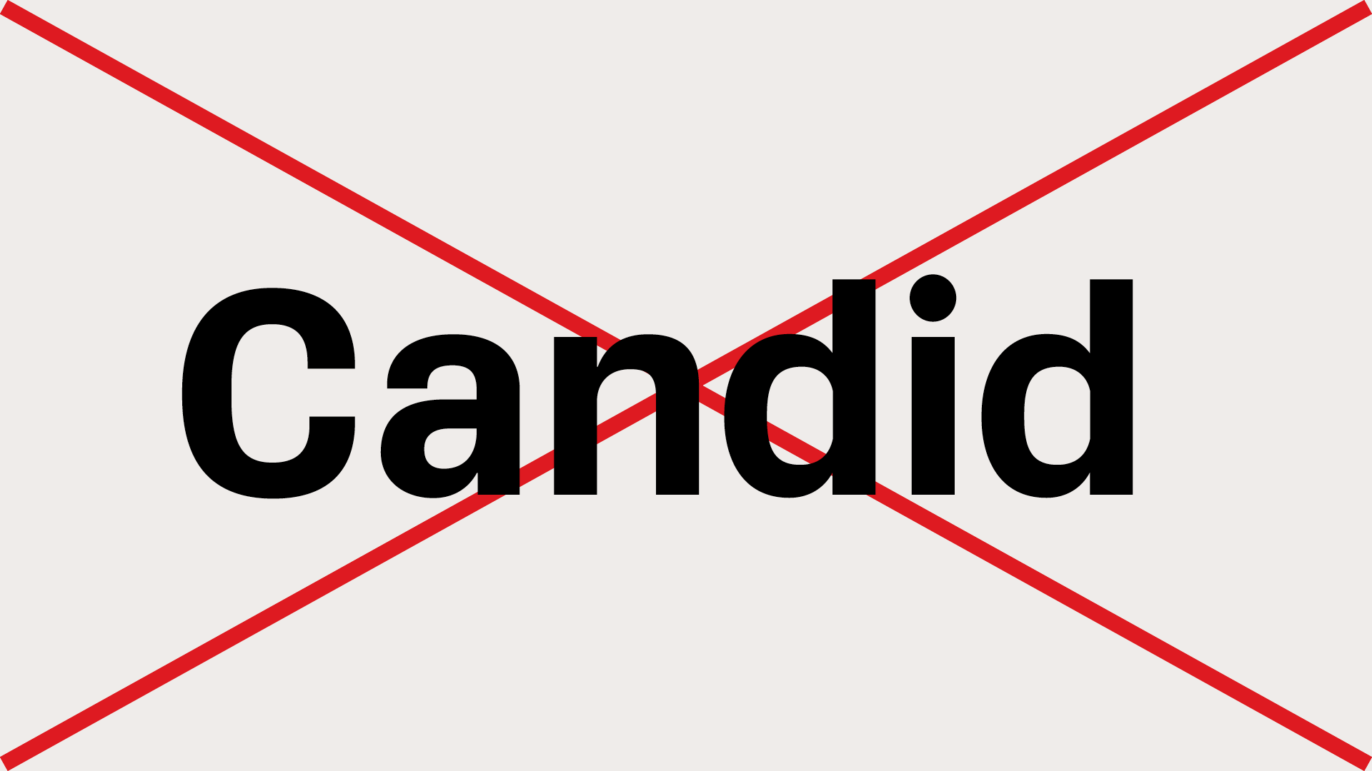
Don’t delete the period.
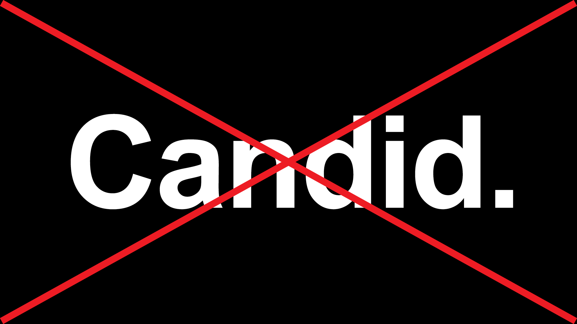
Don’t use a different font to imitate the logo.
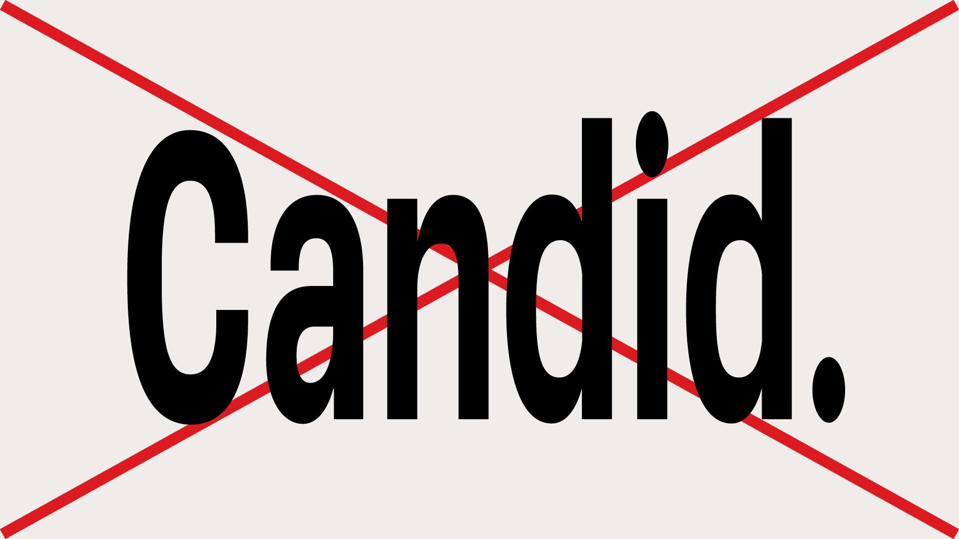
Don’t stretch or distort it.
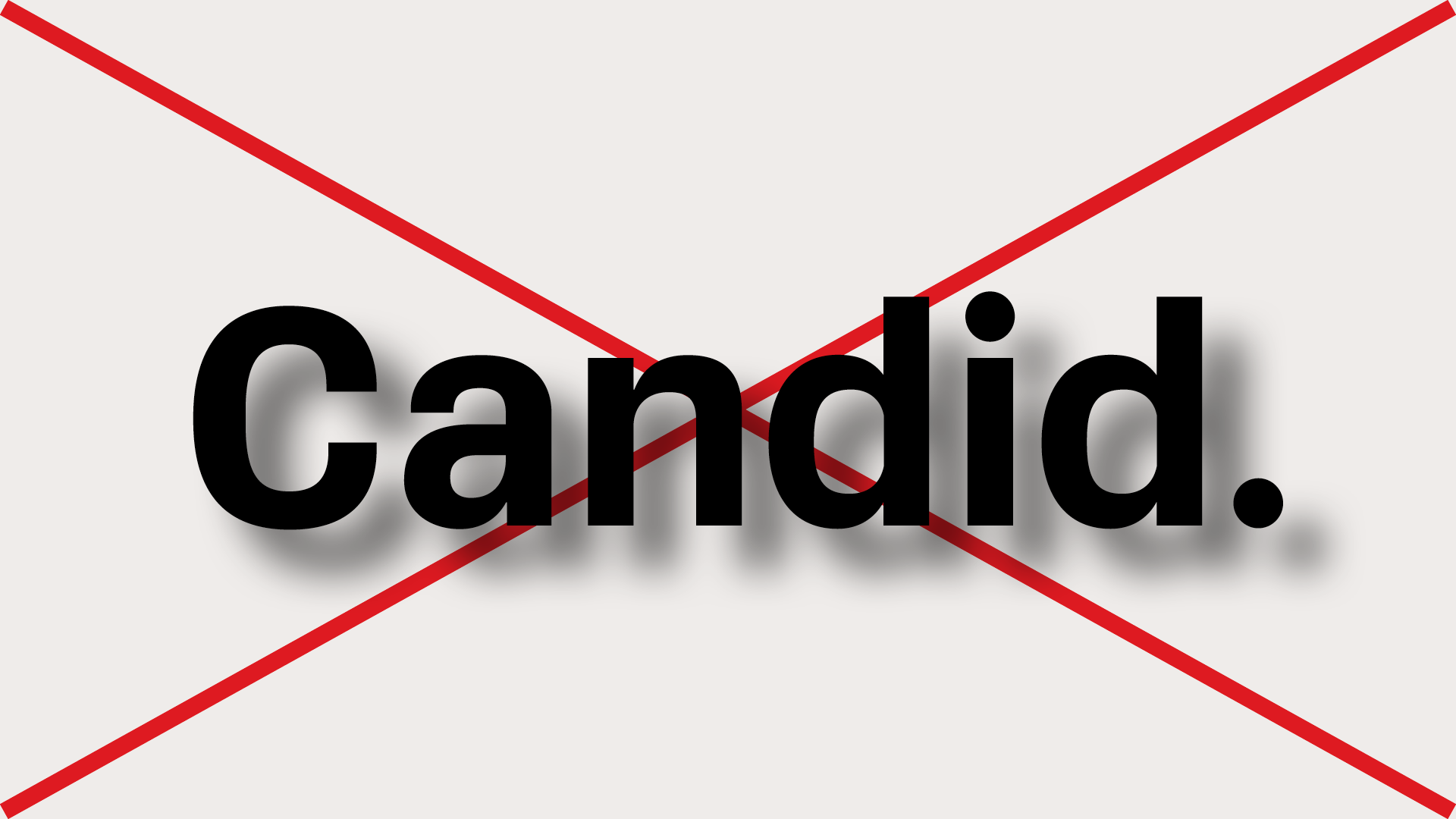
Don’t use shadows or effects.
Icon
The icon version of our logo is for social media. The square shape works perfectly as a profile image on all platforms, even if cropped to a circle by the platform. Every now and then, you may use the icon when space is extremely tight (less than 3/8″ wide), but check with the design team before using it anywhere other than on social media.
Black on gold

Black on white
White on black
Sizing
Our standard logo is best for name recognition. Only use the icon when space is limited. You should never see it big!

Cropping
It’s fine if the icon gets cropped into a circle by the social media platform. It is designed to fit perfectly.
