Mark-ups
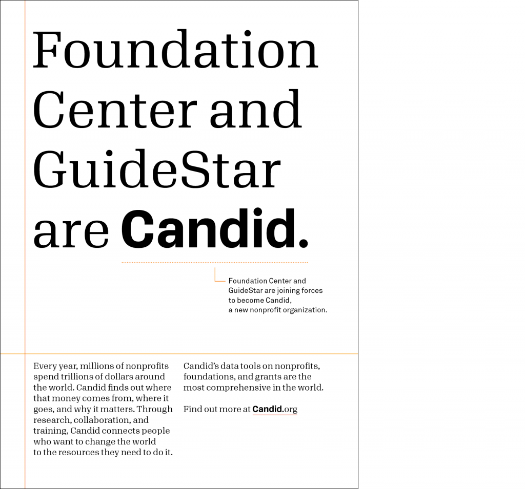
We are insightful. Candid sees things that not everyone can: the structures that hold us together, the important details in any text, and subtle layers of meaning.
Types of mark-ups
Data alone isn’t enough for understanding. With mark-up lines, we can reveal underlying relationships, hidden patterns, and layered meanings. When we look at the world, we see more than meets the eye.
For complex communications
Grid lines reveal structures
Use lines to show the relationship between sections in a layout. This is helpful for communications with multiple pieces of information, such as websites, newsletters, and reports.
For simple communications
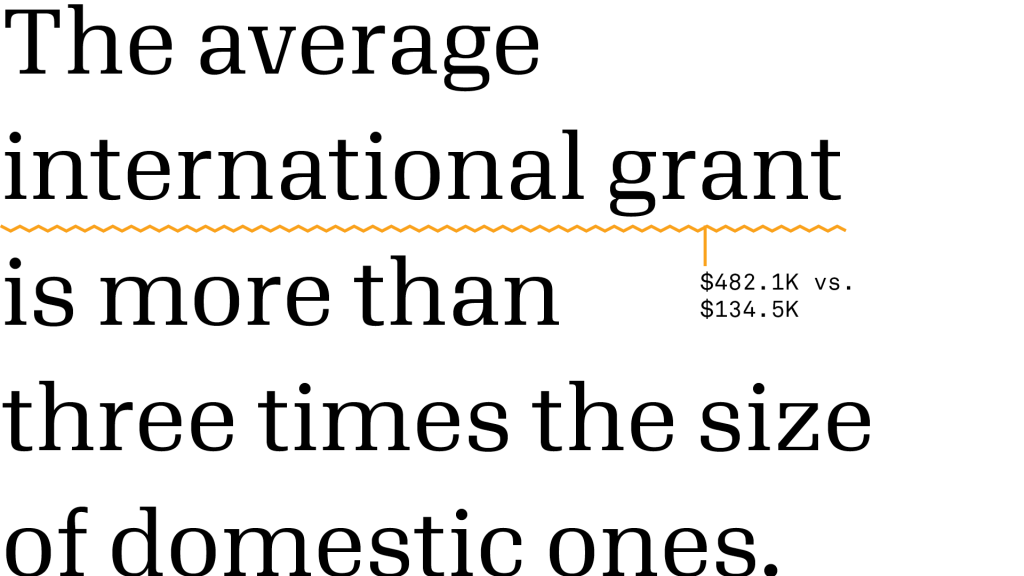
Commentary lines reveal details
Use lines to annotate parts of a text or image, revealing a deeper level of information. This is for brief communications, such as small ads and social posts.

For nonverbal communications
Illustration lines reveal invisible qualities
Use lines to diagram or depict what is otherwise not visible: relationships, attitudes, results, etc. These mark-ups are for illustrations only.
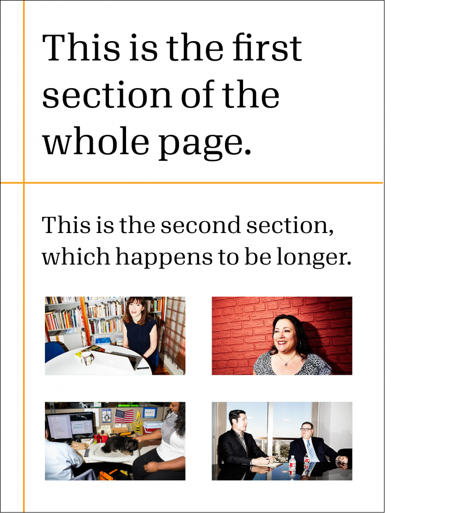
Grid lines
Use lines to show the relationship between separate sections in a single layout. This is for communications with multiple pieces of information, such as websites, newsletters, and reports.
Do
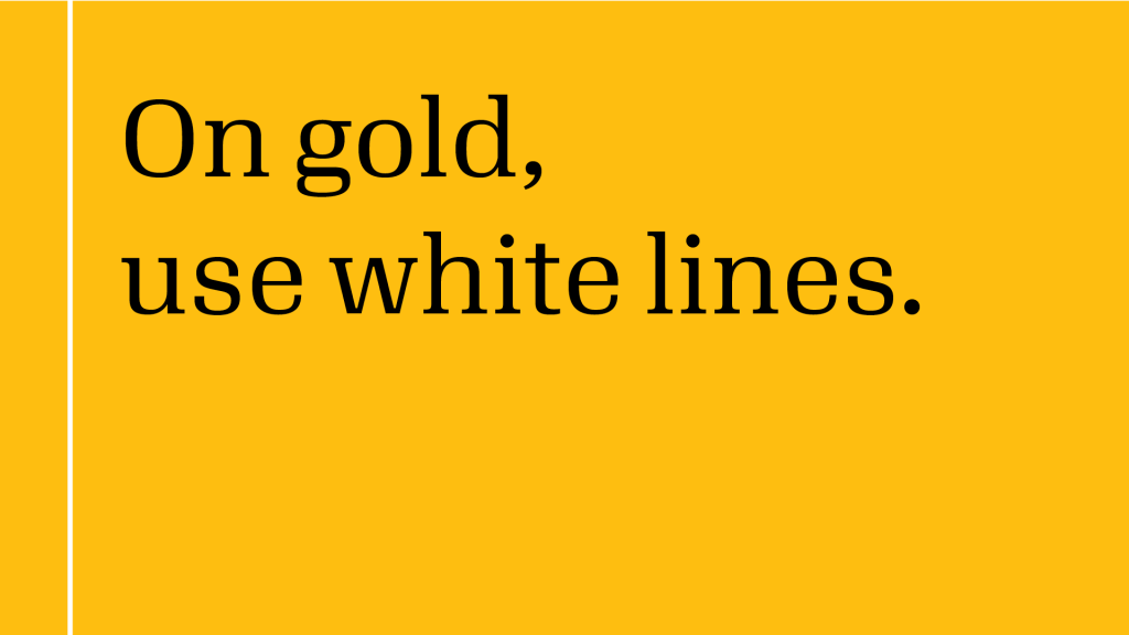
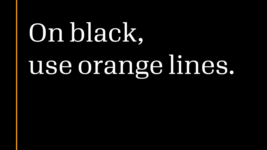
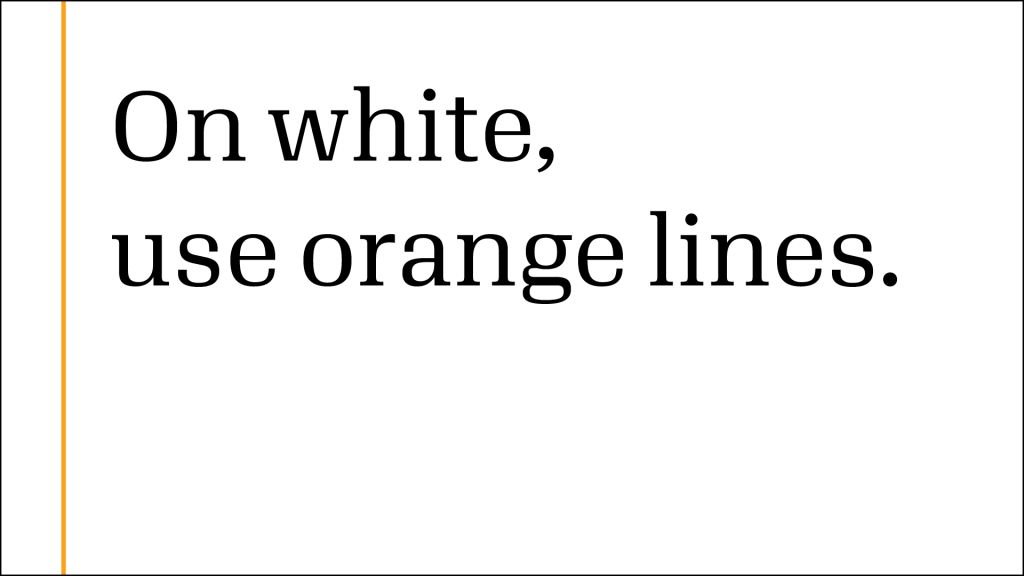
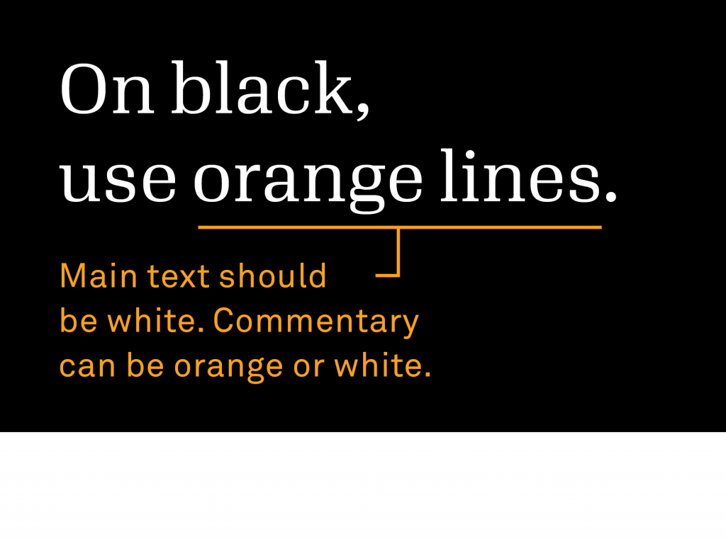
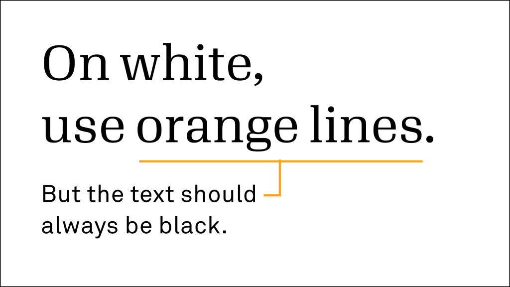
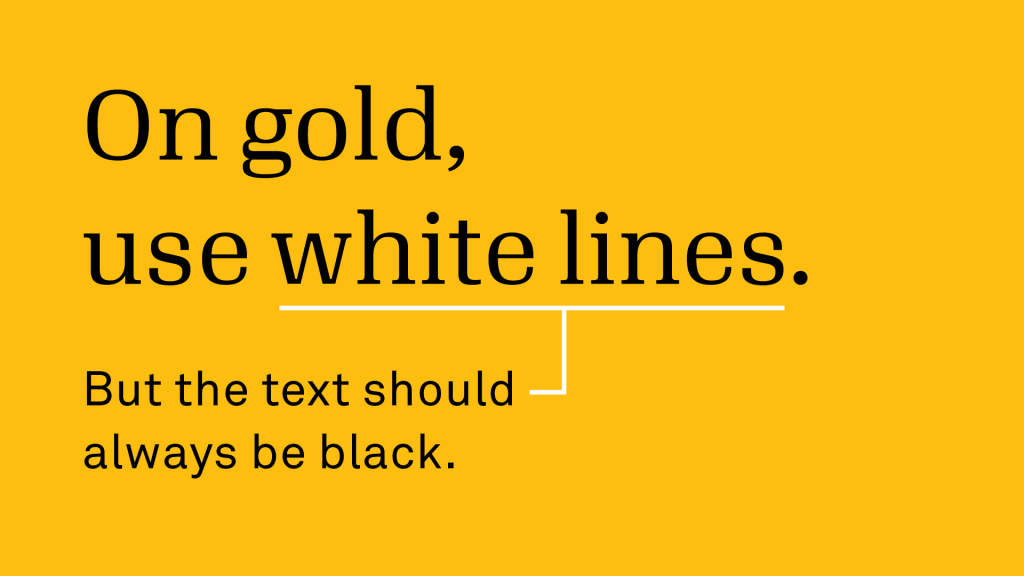
Use orange lines on white or black backgrounds, white lines on
gold backgrounds.
Do
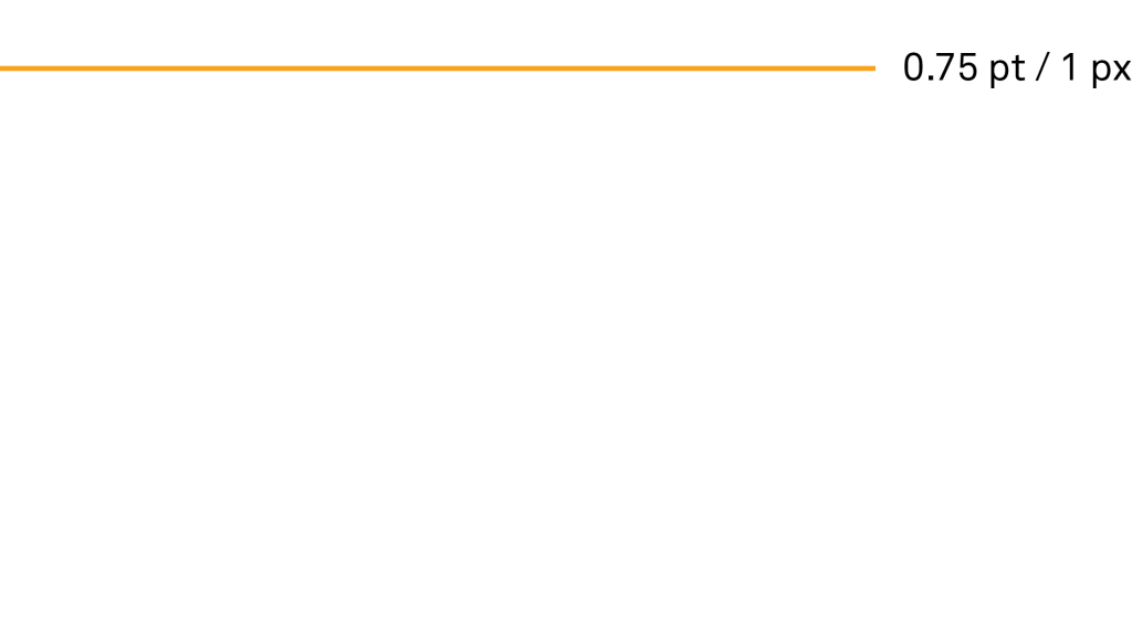
Use solid, thin lines—0.75 pt in print and 1 px on screen. Make sure lines are consistent throughout your design.
Do
Use lines to show the relationship between different sections.
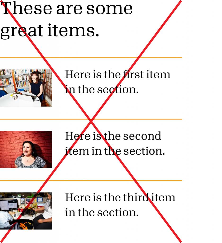
Don’t
Don’t use lines to divide parts within the
same section.
Commentary lines
Use lines to reveal more details about very short texts or photographs. This is for brief communications, such as small ads, social posts, and headlines. It’s a special visual treatment, and it should be large and noticeable. Don’t use this style for body text. Mark-ups are not the same as footnotes.
Do
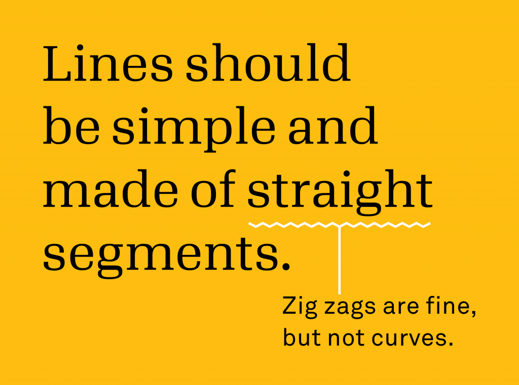
Keep lines simple and angular, and make sure they are clear of the text.
Do
Use orange lines on white or black backgrounds, white lines on gold backgrounds. But for accessibility, stick to the text color rules.
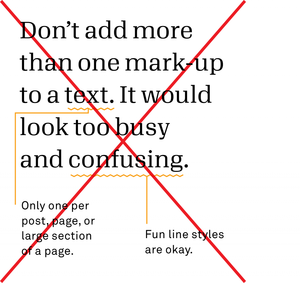
Don’t
Never add more than one to any post, page, or large section of a page.
Don’t
Don’t use mark-ups for body text. They are a special visual treatment, not a replacement for standard footnotes.

Do
Use solid, thin lines or slightly thicker dotted lines. This will make the two line styles look equally prominent.

Illustrations
It can be hard to get a photograph that illustrates the point you want to make—especially one that meets our requirements. The Candid illustration style comes in handy because it uses stock photos and mark-ups to create meaningful—and distinctive—images.

Illustration or icon?
Illustrations are individual. Icons are universal. If you want an image for a very simple concept that will need to be reused across platforms and products, create an icon. If you’re looking for an image to accompany a very specific point, make an illustration.
Illustration lines
Candid illustrations are made of black-and-white silhouetted images and mark-up lines. Use the lines to show what is otherwise not visible in the photo itself: relationships, attitudes, results, etc.
Do
Use orange lines on white backgrounds, and white lines on gold backgrounds.

Do
Use straight, thin lines—0.75 pt in print and 1 px on screen. Make sure lines are consistent throughout your design.

Don’t
Never use curvy or thick lines.


Don’t
Don’t draw most of the illustration. The lines should add meaning to a photograph, not the other way around.